The bake-off
Five models, one portfolio. Which would you have trusted in March 2020?
The earlier modules built the models. This module compares them, which involves judgement as well as calculation.
You now have five estimates of the same covariance matrix:
| # | Model | Parameters | Built in |
|---|---|---|---|
| 1 | Sample covariance | 3,321 | Module 3 |
| 2 | EWMA covariance | 3,321 | Module 5 |
| 3 | Single-factor | 163 | Module 7 |
| 4 | Cross-sectional | 186 | Module 8 |
| 5 | Statistical / PCA | ~490 | Module 9 |
The estimates differ, and the exercise is to work out which differences matter and form a view you can defend. There is no answer key for the last section of this module; write half a page and we will talk about it.
First, the trap
Compute your portfolio's realised volatility over a window. Then compute the Module 3 sample-covariance prediction over the same window.
They will match almost exactly. On the equal-weighted portfolio over the 156 weeks to September 2026, both come out at 13.05%.
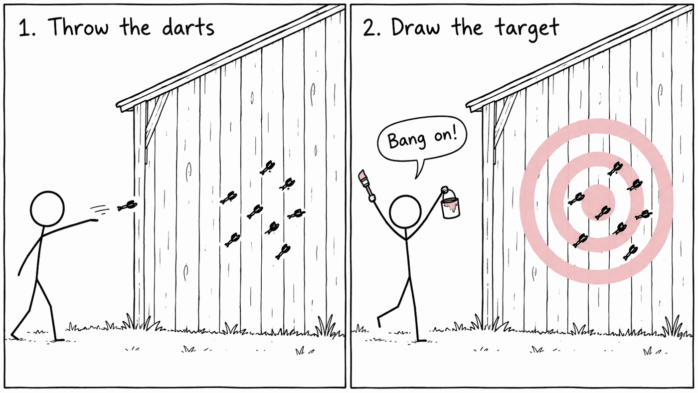
This tells you nothing about forecasting ability, because the sample covariance was estimated on that same window.
Many flawed backtests make a version of this mistake. A useful question to ask of any backtest is: what data did the model see before it made this prediction?
The bias statistic
The bias statistic is a fairer test.
For each week, predict the volatility using only data available before that week. Then standardise what actually happened:
If the model is calibrated, these standardised returns should have a standard deviation of 1. So:
- bias > 1 — you understated risk. Returns came out bigger than predicted.
- bias < 1 — you overstated risk, and held capital against nothing.
- bias ≈ 1 — calibrated.
The rolling forecast
With portfolio returns in column B:
prediction   =STDEV.S(OFFSET(B2, ROW()-106, 0, 104, 1))
ratio        =B107 / C107
bias =STDEV.S(D107:D1114)For the EWMA version, update the variance after recording each forecast:
forecast_t  =SQRT(var_t)
var_(t+1) =0.94*var_t + 0.06*r_t^2What you should get
On the equal-weighted portfolio over the full sample:
| Forecast method | Bias | Weeks with abs(b) > 3 |
|---|---|---|
| Rolling 52 weeks | 1.098 | 17 |
| Rolling 104 weeks | 1.100 | 21 |
| Rolling 260 weeks | 0.964 | 11 |
| EWMA λ = 0.94 | 1.060 | 10 |
| EWMA λ = 0.97 | 1.040 | 15 |
Three points from this table.
All the methods except the long window understate risk, with biases above 1. Volatility clustering means large moves tend to arrive together, so forecasts built on calm periods are caught out.
EWMA with λ = 0.94 has the fewest extreme outliers: 10, against 21 for a flat 104-week window. As well as bringing the bias closer to 1, it reduces the size of the errors in the worst weeks, which are the ones that cost the most.
The 260-week window scores 0.964, but that is misleading. It is closest to 1 because it is too high in calm periods and too low in crises, and the two errors partly cancel. A single summary statistic can hide offsetting errors, which is why the outlier count is worth looking at as well.
Test 2: the crises, one at a time
An average over twenty years hides how the methods behave in crises.
Run your forecasts through each episode and compare EWMA(0.94) with a rolling 104-week window:
| Episode | EWMA(0.94) | Rolling 104w |
|---|---|---|
| Calm, H1 2007 | 10.8% | 11.8% |
| GFC peak, Q4 2008 | 34.6% | 23.5% |
| Covid, Mar–Apr 2020 | 37.0% | 21.2% |
| Gilt/LDI, Sep–Oct 2022 | 15.1% | 14.8% |
| Latest | 12.2% | 13.5% |
In the two big equity crises, EWMA is 11 and 16 percentage points higher. The rolling window still contains years of calm data, so by the time it catches up the crisis has passed. If you had quoted the 104-week number in March 2020, you would have told a portfolio manager that their risk was about half what it was.
The fourth row is also worth noting: the 2022 gilt crisis barely shows up in equity volatility. It was a severe event for UK pension schemes, yet both measures put FTSE 100 equity volatility at around 15% during it.
The shock was transmitted through gilt yields, so it affected long-duration equity sectors: real estate volatility was 1.6 times its calm-period level and utilities 1.25 times, while banks were largely unaffected. An equity risk model was not the right tool for monitoring that episode.
Test 3: where the models disagree most
Build three portfolios and price each under all five matrices:
- Five banks. Concentrated in one industry.
- Five names from five different industries. Well spread.
- Your own portfolio.
Based on Module 8, you should expect the single-factor model to understate the bank portfolio. The cross-sectional model does not do much better for banks, because its Financials factor mixes banks with insurers and asset managers, although it does better for groups such as miners. The sample covariance will look good in-sample, which, as above, says little about how well it forecasts.
Test 4: minimum variance, out of sample
For each Σ, find the minimum-variance portfolio: the weights minimising w′Σw subject to the weights summing to 1. Use Solver, or directly:
The closed form
=MMULT(MINVERSE(Cov), ones) / SUM(MMULT(MINVERSE(Cov), ones))You should find that the sample covariance produces the most extreme weights and the worst out-of-sample result, often including large negative positions if you allow them.
The reason is that matrix inversion amplifies the smallest eigenvalues, and the smallest eigenvalues of a sample covariance matrix estimated from 3,321 parameters and 1,114 observations are mostly noise. The optimiser puts large weights on those directions because they appear to offer diversification, when in fact they mostly reflect estimation error.
So the matrix that fits the past most closely can forecast worst. Factor models tend to do better because they impose structure and estimate fewer parameters.
What this is called, and what it fixes
This is the bias-variance trade-off, and the main fixes are worth knowing by name: Ledoit-Wolf shrinkage pulls the sample matrix toward a structured target; random matrix theory filters eigenvalues indistinguishable from noise; factor models impose structure directly. All three accept some bias in exchange for lower variance.
The question to answer
It is 24 February 2020. A portfolio manager asks you for one tracking-error number for your portfolio. Which model, which window, what number do you give, and what do you say about the uncertainty around it?
Write half a page. Good answers tend to include:
- A choice, made explicitly, with the reason stated.
- An acknowledgement that on that date every one of these models was about to be wrong, and roughly by how much.
- Something about the conversation as well as the number: what you would tell the manager to watch.
- An acknowledgement that a model estimated on survivorship-biased data from today's index constituents has limits on how good it can be.
There is no single correct answer. A good answer shows that you understand what each model assumes.
That is the core programme
You have built an equity risk model from a column of prices, five different ways, and you know why they disagree. You have found bad data by looking at it. You know what tracking error is, where risk comes from in a portfolio, what VaR does and does not tell you, and why the model that fits the past best can forecast worst.
Come and find me — I would like to hear which part surprised you most.
After that, Module 11 leaves the normal distribution behind and looks at the shape of the tails.
Check your answers
Sign in to get your own portfolio and have your answers marked.