Fat tails, crashing together, and Monte Carlo
Swap the normal for a Student-t, find out what correlation misses about stocks falling together, and simulate a portfolio that knows about both.
Modules 11 and 12 looked at the fat tail of a single return series. A portfolio needs one more thing: how its holdings behave together when things go wrong.
This module has three parts:
- A fat-tailed distribution you can put in a formula. The Student-t.
- What correlation leaves out. Rank correlation, stocks crashing together, and copulas.
- Monte Carlo. A simulation that combines the two, one random scenario at a time.
It is the heaviest spreadsheet in the programme, and a natural place to see why the team does most of this in Python.
Part 1: the Student-t distribution
The Student-t looks like a normal distribution with heavier tails, and one parameter, the degrees of freedom ν, controls how heavy.
- Its tails fall away like a power law with exponent ν, the same α you fitted in Module 12.
- As ν grows it turns into the normal distribution.
- Its excess kurtosis is 6/(ν − 4), which is infinite for ν of 4 or less.
- Its variance is ν/(ν − 2) rather than 1, so to give it a chosen volatility you multiply by √((ν − 2)/ν).
Choosing ν
Two routes, using what you have already built:
| Route | On our portfolios | Implied ν |
|---|---|---|
| From kurtosis: ν = 4 + 6/K, using Module 11's weekly excess kurtosis | K typically about 5.6 | about 5.1 (4.7 to 5.7 for four portfolios in five) |
| From the tail: ν = α, using Module 12's daily tail exponent | α typically about 3.5 | about 3.5 |
They disagree, which by now should not be a shock: kurtosis is dominated by a few weeks, and α depends on where you cut the tail. This module uses ν = 4, between the two. At ν = 4 the kurtosis is infinite, which fits what Module 12 found.
Student-t VaR
Parametric VaR from Module 6, with a t in place of the normal:
One cell
=-T.INV(0.01, 4) * SQRT(2/4) * STDEV.S(PortRet)T.INV(0.01, 4) is −3.747. After scaling to unit variance, the 99%
multiplier is 2.649 standard deviations, against 2.326 for the normal.
Across 300 portfolios built the same way as yours:
| 99% VaR, relative to historical | 95% VaR, relative to historical | |
|---|---|---|
| Normal | 0.85× | 1.13× |
| Student-t, ν = 4 | 0.97× | 1.03× |
At 99% the normal falls well short and the t comes close. At 95% the t's multiplier is 1.507 against the normal's 1.645, so it comes out lower: the Module 11 gotcha, built into the distribution.
Expected shortfall behaves the same way. The t's 99% ES is 3.70 standard deviations against the normal's 2.67, and on our portfolios it lands at a median of 0.98× historical ES.
One parameter, chosen by eye, and a portfolio's tail is described about as well as by its own history. That is a good result for a single formula.
Part 2: what correlation leaves out
Rank correlation
Ordinary (Pearson) correlation multiplies deviations together, so the weeks with the biggest moves carry the most weight. Rank correlation (Spearman's) replaces each return with its rank before correlating, so a −20% week counts as "the worst week" and no more.
Rank correlation
=CORREL(RANK.AVG(A2:A1115, A2:A1115), RANK.AVG(B2:B1115, B2:B1115))RANK.AVG gives tied values their average rank, which is the standard
convention.
Compare the two on some pairs, then drop the three weeks with the largest combined move and compute them again:
| Pair | Pearson | Without 3 weeks | Rank | Without 3 weeks |
|---|---|---|---|---|
| Barclays / Lloyds | 0.753 | 0.711 | 0.689 | 0.686 |
| Rio Tinto / Anglo American | 0.717 | 0.774 | 0.798 | 0.802 |
| BP / Shell | 0.843 | 0.804 | 0.789 | 0.787 |
Three weeks out of 1,114 move the Pearson correlation by 0.04 to 0.06, and not always in the same direction: down for the banks, whose crisis weeks were shared, and up for the miners, whose biggest weeks were not. The rank correlation barely notices.
Across all 3,240 pairs of stocks, the two measures agree on average: a median of 0.288 for Pearson and 0.287 for rank. Rank correlation is not systematically higher or lower. It is steadier, because no single week can dominate it.
Crashing together
A correlation, of either kind, summarises how two stocks move across all weeks. Risk is often more interested in the worst weeks.
Count the weeks when both stocks were in their own worst 5%. If they were independent you would expect 1,114 × 5% × 5% = 2.8 weeks. With correlation you expect more, but how many more depends on the shape of the dependence, and that is where a copula comes in.
A copula describes how variables move together once you have stripped out their individual distributions: it is the dependence structure on its own, measured in ranks. Any joint distribution splits into the individual distributions plus a copula. Rank correlation is a property of the copula alone, which is part of why it is the natural measure here.
Two copulas are the standard starting points:
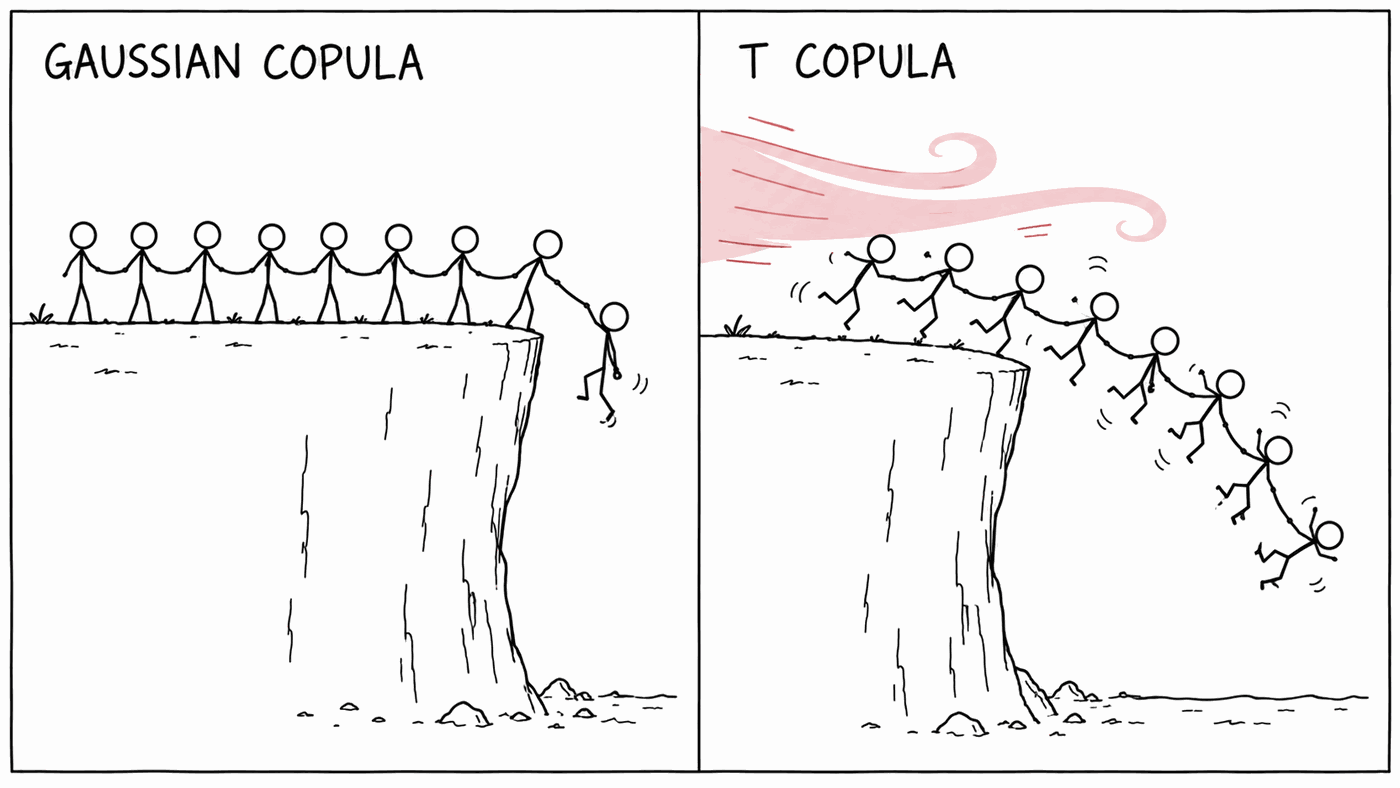
- The Gaussian copula is the dependence of correlated normal variables. It has a well-known weakness: however high the correlation, extreme moves become close to independent in the far tail.
- The t copula multiplies all the variables in a scenario by the same random amount. When that amount is large, everything moves a long way at once, so joint crashes are much more likely.
Here is the count for some pairs, against each copula with its correlation set to match the pair's rank correlation:
| Pair | Weeks both in worst 5% | Gaussian copula expects | t copula (ν = 4) expects |
|---|---|---|---|
| Barclays / Lloyds | 32 | 23.3 | 27.7 |
| Rio Tinto / Anglo American | 30 | 29.0 | 32.8 |
| BP / Shell | 30 | 28.5 | 32.5 |
| Barclays / National Grid | 10 | 4.3 | 9.1 |
| HSBC / Tesco | 10 | 8.2 | 13.3 |
| Rio Tinto / Unilever | 5 | 5.3 | 10.4 |
Single pairs are noisy, since each count is a handful of weeks. Add them up across all 3,240 pairs:
| Weeks both in worst 5%, summed over all pairs | |
|---|---|
| If independent | 9,023 |
| Gaussian copula | 27,446 |
| t copula, ν = 4 | 44,396 |
| Actual | 44,864 |
Stocks crashed together 1.63 times as often as the Gaussian copula says they should, and the actual count beat the Gaussian prediction for 95% of pairs. The t copula lands within 1%. That is flattering: ν = 4 was not fitted to this, and pairs of stocks are not independent pieces of evidence, since the same crises turn up in every one of them. The direction is not in doubt, though.
Crashes are shared more than rallies
Do the same count for weeks when both stocks were in their best 5%. The total is 34,569, well below the 44,864 shared crashes. Both copulas above are symmetric, so they predict the same number for rallies as for crashes: the Gaussian too few, and the t copula too many. Copulas with more dependence in the lower tail than the upper, such as the Clayton copula, exist for exactly this reason.
The Gaussian copula has some history here. It was widely used before 2008 to price portfolios of mortgage-backed debt, where the probability of many borrowers defaulting together was the whole question, and it had a very bad press afterwards.
Part 3: Monte Carlo
For a fixed portfolio of shares you could fit a t to the portfolio's own returns, as in Part 1, and stop. Monte Carlo is how you build the answer from the parts instead. That is what you need when the portfolio is about to change, when it holds options whose value is not a straight line in the share price (Module 6 shows what that does to a normal VaR), or when you want to choose the tails and the dependence separately, as Part 2 suggests you should.
The recipe: generate thousands of random scenarios for all your holdings at once, value the portfolio in each one, and read VaR and expected shortfall straight off the pile of results.
Correlated shocks, the Module 7 way
You need random shocks for 12 stocks that are correlated with each other. Module 7's single-factor model gives a simple way to do it without any matrix decomposition. For each holding i, with ρi its correlation with the market:
where Zm and every ei are independent standard normal draws. Each zi is standard normal, and any two are correlated by ρiρj.
Use the CAPFIXED_TR benchmark as the market here rather than CUKX.L, because
CUKX.L only starts in 2010. This structure inherits Module 7's weakness: it
routes all correlation through the market. On our portfolios it gives a
volatility about 4.4% lower than the full covariance matrix.
Three versions of the same simulation
All three use the same correlated normal shocks zi, and scale each holding to its own weekly volatility σi:
| Version | Each stock's tail | How they move together | Weekly return of holding i |
|---|---|---|---|
| A | normal | Gaussian copula | σi zi |
| B | t, ν = 4 | Gaussian copula | σi √½ T.INV(Φ(zi), 4) |
| C | t, ν = 4 | t copula | σi √½ zi W |
In B, each normal shock is converted to its rank with the normal CDF Φ and then turned into a t with the same rank, which changes the tails and leaves the copula alone. In C, W = √(4/χ²4) is one random draw per scenario, shared by all 12 holdings. That shared draw is the t copula: in a scenario where W comes out large, everything is scaled up together. B and C have identical individual distributions; only the way the stocks move together differs.
10,000 scenarios in a handful of formulas
Set up a row of 12 correlations with the market, rho, a row of 12 weekly
volatilities, vol, and your weight column, weights:
rho       =CORREL(ReturnsW!B2:B1115, MarketW!$B$2:$B$1115)     ' drag across
vol =STDEV.S(ReturnsW!B2:B1115) ' drag acrossZm =NORM.S.INV(RANDARRAY(10000))
e =NORM.S.INV(RANDARRAY(10000, 12))
z =Zm# * rho + e# * SQRT(1 - rho^2)
W =SQRT(4 / CHISQ.INV.RT(RANDARRAY(10000), 4))
A =z# * vol
B =T.INV(NORM.S.DIST(z#, TRUE), 4) * SQRT(2/4) * vol
C =z# * W# * SQRT(2/4) * volz line work. For each version:
port  =MMULT(C#, weights)
VaR   =-PERCENTILE.INC(port#, 0.01)
ES    =-AVERAGEIF(port#, "<=" & -VaR)
RANDARRAY draws new numbers every time anything in the workbook changes,
so switch to manual calculation (Formulas → Calculation Options) and
press F9 when you want a fresh set of scenarios.
What comes out
Across 60 portfolios, with a very large number of scenarios so the simulation noise is negligible, relative to each portfolio's historical 99% VaR and ES:
| Version | 99% VaR | 99% ES |
|---|---|---|
| A: normal, Gaussian copula | 0.83× | 0.68× |
| B: t tails, Gaussian copula | 0.88× | 0.78× |
| C: t tails, t copula | 0.94× | 0.94× |
Going from A to B, fattening each stock's own tail, raises expected shortfall by 16%. Going from B to C, letting the stocks crash together, raises it by another 20%. For a portfolio, the way the tails line up matters as much as how fat each one is.
Version C still sits a little below history, and most of that gap is the single-factor structure: correct for its 4.4% shortfall in volatility and C lands within about 2% of historical VaR and ES. Remember also that historical VaR and ES were measured on the same weeks they are being compared with, which is Module 10's trap, so matching them is a sanity check rather than a triumph.
Monte Carlo is noisy
Press F9 a few times and watch your VaR move. With 10,000 scenarios, version C's 99% VaR is typically about 2% away from the answer you would get from millions of scenarios, and one time in a hundred it is out by 7%. Expected shortfall is noisier, because it averages only the worst 100 scenarios: typically 3% out, and one time in a hundred 12%.
The noise shrinks with the square root of the number of scenarios, so four times as many halves it. The self-check on your simulated expected shortfall allows 12%, for that reason.
Where Excel runs out
Everything here was built for 12 holdings, with one market factor and one
ν. A production version would want the full 81-name correlation matrix
(which means a Cholesky decomposition rather than a single factor), a separately
fitted tail for each stock, an asymmetric copula, and options priced in every
scenario. That is several million cells of RANDARRAY in a spreadsheet, and a
few lines of Python.
What to take away
- A Student-t with ν around 4 describes a portfolio's tail far better than the normal, at 99% and at 95%.
- Rank correlation measures the same thing as ordinary correlation, more steadily, because no single week can dominate it.
- Stocks crash together much more often than a Gaussian copula allows. A t copula gets much closer.
- In a portfolio simulation, how the tails line up matters as much as how fat each one is.
- Monte Carlo answers carry simulation noise. Know how big it is before quoting a number.
That is the programme
You started with a column of prices and finished with a simulation of how twelve stocks might fall together. Along the way you have met most of the ideas a risk team uses, and, more usefully, where each one breaks.
Come and find me, and tell me which model you would actually trust.
Check your answers
Sign in to get your own portfolio and have your answers marked.