Drawing a line into the tail
Plot the worst days on a log-log chart, fit a straight line, and extend it past anything in the data. Then ask how far to trust it.
Module 11 described the tail with kurtosis, a single number computed from every week in the sample, and watched it wobble. This module ignores the other 99% of the distribution and looks only at the worst days.
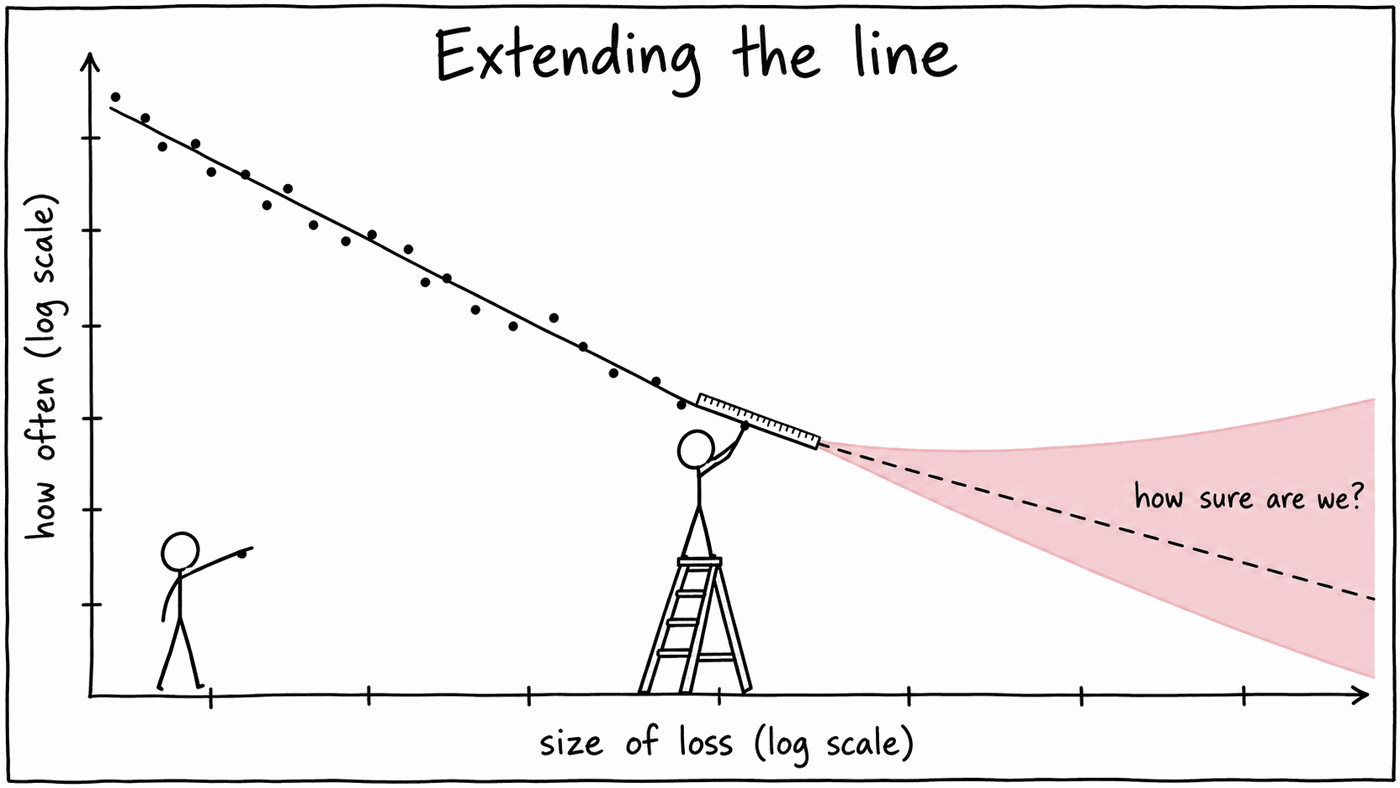
The method is simple enough to sketch on a napkin. Take the largest losses, plot them on a log-log chart, draw a straight line through them, and follow the line out past the edge of the data to ask how often something worse might happen.
Drawing the line is the easy part. A real chart is wigglier than the napkin version, and where the line goes depends heavily on how many of the losses you let into it. Much of this module is about that judgement.
The idea
Suppose that for large losses, the chance of a loss at least as big as x falls away like a power of x:
Take logs of both sides:
That is a straight line, with slope −α, on a chart of ln P against ln x. The number α is the tail exponent. A small α means a fat tail: doubling the size of a loss only divides its probability by 2α.
A normal distribution has no such line. Its tail falls away faster than any power, so on the same chart it bends downwards, more and more steeply the further out you look.
Building it
Doing it in Excel
Step 1: daily portfolio returns. The same idea as Module 6, on the daily
sheet from Module 2 this time. With your 12 names in ReturnsD!B2:M5406 and
your weights in a column called weights:
=MMULT(ReturnsD!B2:M5406, weights)PortRetD. Use daily rather than weekly returns here: with
5,405 days, the 50 worst are the worst 1%, while the 50 worst weeks would
reach down to the worst 4.5%.
Step 2: the 50 largest losses, biggest first, as positive numbers:
loss   =LARGE(-PortRetD, SEQUENCE(50))
rank   =SEQUENCE(50)
prob   =rank / COUNT(PortRetD)
prob is the share of all days with a loss at least this big: the largest
loss happened on 1 day in 5,405, the second largest was matched or beaten on
2 days, and so on. Divide by the total number of days, not by 50.
Step 3: the line.
slope      =SLOPE(LN(prob), LN(loss))
intercept  =INTERCEPT(LN(prob), LN(loss))
alpha      =-slope
Step 4: look at it. Insert a scatter chart of prob against loss,
then format both axes with a logarithmic scale. Add a trendline, choose
Power, and tick Display equation and Display R-squared. Excel fits the
trendline by exactly the regression above, so the exponent in its equation
is your slope.
Losses in decimals (0.04) or in percent (4) give the same slope. Only the intercept changes, and any probability you later read off the line comes out the same either way, as long as you stay consistent.
What the benchmark shows
On the CAPFIXED_TR benchmark, the 50 largest daily losses run from 3.29% up to
11.08%, on 12 March 2020. The fit gives:
| Tail exponent α | 3.31 |
| R² of the line | 0.985 |
Fifty points, and they sit on a line.
Before reading much into that R², run the same recipe on returns that really are normal. Simulate 5,405 normal daily returns with the benchmark's volatility, take the 50 largest losses and fit the line. The R² is still about 0.97, because 50 sorted points drawn from a gently curving tail look fairly straight too. What gives the game away is the slope: α comes out at about 8.
So on this chart the useful evidence of a fat tail is α, and the fact that it holds steady as you add points. A high R² on its own proves very little.
Where the 50 days come from
Twenty-three of the 50 worst days fall in 2008 and 2009, and twelve in 2020. The points on your chart are mostly two crises seen day by day, rather than fifty separate accidents. Keep that in mind when a line through them looks authoritative.
An exponent of about three
An α near 3 for stock returns is one of the more durable findings in empirical finance, sometimes called the inverse cubic law. Our data agrees. Across 300 portfolios built the same way as yours, α from the 50 largest losses ran from 3.2 to 3.9 for four portfolios in five.
That number connects straight back to Module 11. For a power-law tail, the moments of order α and above do not exist: the integral that defines them is infinite. With α between 3 and 4 the variance is finite, but the fourth moment is not. If that describes the true distribution, kurtosis has no true value to converge to, and every new crisis can push the estimate somewhere new. That is Module 11's weekday wobble, seen from the tail.
The error bars deserve a mention before this becomes a slogan. The standard error on an estimate of α from 50 points is roughly α/√50, about ±0.4, so a single series cannot firmly rule out a value just above 4. But fitted to 50 points, 95% of the 300 portfolios came out below 4, and none above 4.6.
Fitting the line is a judgement
A regression will always hand you a slope, to as many decimal places as you like, which makes it tempting to run it and move on. Look at the chart first. It will not look like a line drawn with a ruler.
It wiggles
Fit the slope to just ten points at a time, working down the list of losses:
| Losses, by rank | α from those ten points |
|---|---|
| 1–10 | 3.17 |
| 6–15 | 5.91 |
| 11–20 | 3.29 |
| 21–30 | 2.16 |
| 31–40 | 2.10 |
| 41–50 | 2.37 |
| 51–60 | 5.53 |
Within the 50-point fit, the local slope wanders from about 2 to about 6. Each stretch holds only a handful of days, mostly from the same two crises, and a couple of losses landing close together or far apart is enough to tilt it. At some points the line and the data disagree by a factor of 1.28 on how likely a loss that size is. The R² of 0.985 averages all of that into something that looks very tidy.
It depends on where you stop
Nothing in the data tells you where the tail starts. Refit the line with more or fewer of the largest losses, and read the same extrapolation off each one:
| Largest losses used | α | A 20% daily loss, once every |
|---|---|---|
| 10 | 3.17 | 139 years |
| 20 | 3.56 | 198 years |
| 25 | 3.63 | 211 years |
| 50 | 3.31 | 145 years |
| 100 | 3.14 | 115 years |
| 200 | 3.02 | 95 years |
| 300 | 2.71 | 55 years |
α does not drift steadily one way: it climbs to 3.63 at 24 points, then falls. Anywhere from 10 to 200 points would be a defensible choice, and across that range α runs from 3.02 to 3.63 while the 20% day moves from once every 95 years to once every 213. Same data, same method, and the answer more than doubles depending on where you stopped counting.
Go further still and the line starts to take in ordinary days from the body of the distribution, which do not follow the tail's law. With 500 points α is 2.35, and with 1,000 it is 1.92.
Your own portfolio will do something similar. Across the 300 portfolios, moving from 20 points to 200 shifted α by more than 0.5 in over half of them. Read the 20%-day answer off lines fitted to 20, 50, 100 and 200 points: typically the largest of the four is 2.3 times the smallest, and for one portfolio in ten it is five times.
Draw the stability plot
Extend step 2 to the 200 largest losses, spilled from B2, with their
probabilities spilled from C2. Put the numbers 10 to 200 down column E,
and beside each one the α from that many points:
=-SLOPE(LN(TAKE(C2#, E2)), LN(TAKE(B2#, E2)))So what do you report?
A range, with the choice spelled out. For the benchmark, something like: "α between about 3.0 and 3.6 on anything from 10 to 200 points, which puts a 20% day at roughly once a century to once every two centuries."
Choose the cut-off by looking at the chart and the stability plot, rather than by hunting for the best R², and be ready to show what happens if someone picks differently, because someone will. Every method for fitting tails runs into this. In extreme value theory it is called threshold selection, and experienced people disagree about it.
The self-check fixes the number at 50 so that there is one answer to mark against. It carries no more authority than that.
Extending the line
Now the reason for drawing it. The fitted line gives a probability for any size of loss, including sizes that never happened:
Divide one by that probability and you have the average number of days between such losses; divide by 252 for years. For the benchmark, using the 50-point line, over its 21.4 years of data:
| Daily loss of at least | Actual days | Power law expects | Power law: once every | Normal: once every |
|---|---|---|---|---|
| 5% | 17 | 14.6 | 1.5 years | 616 years |
| 7% | 4 | 4.8 | 4.5 years | 7.8 million years |
| 10% | 1 | 1.5 | 15 years | more than a trillion years |
| 15% | 0 | 0.4 | 56 years | more than a trillion years |
| 20% | 0 | 0.1 | 145 years | more than a trillion years |
Within the data, the power law tracks reality closely. The normal distribution, with the same volatility, calls a 5% day a once-in-six-centuries event; the benchmark had seventeen of them.
The bottom two rows are pure extrapolation. The worst day in the sample was 11%, and the line is being asked about 15% and 20%.
How far should you trust it?
The error bars grow as you extend it
Pin the line at the 50th-largest loss and move α by one standard error either way, from 2.88 to 3.74. A 20% day goes from once every 78 years to once every 368 years. The same data, and a perfectly respectable fit, support both. That uncertainty comes on top of the choice of cut-off, which on its own moved the same answer between 95 and 213 years.
The further out you extrapolate, the more a small uncertainty in the slope turns into a large uncertainty in the answer.
A fair test
Module 10's rule applies here too: judge a model on data it had not seen. Fit the line on 2005 to 2019 only, then count what happened from 2020 onwards:
| Daily loss of at least | 2020 onwards: actual | Power law fitted to 2005–2019 |
|---|---|---|
| 3% | 26 | 20.7 |
| 5% | 4 | 4.3 |
| 7% | 2 | 1.5 |
| 10% | 1 | 0.5 |
That is a good result. The 2005–2019 fit had never seen Covid, and it expected roughly the number of large days that Covid delivered.
A less fair test
Now fit on 2005 to 2007 alone, 681 calm days, using the largest 25 losses. α comes out at 2.98, almost exactly the full-sample value. Then look at 2008 onwards:
| Daily loss of at least | 2008 onwards: actual | Power law fitted to 2005–2007 |
|---|---|---|
| 3% | 64 | 28.0 |
| 5% | 17 | 6.1 |
| 7% | 4 | 2.2 |
| 10% | 1 | 0.8 |
The slope was right and the line was in the wrong place. Annualised volatility was 13.5% over the fitting period and 18.8% afterwards, and when the whole distribution widens, the tail moves out with it.
That separates two things the line is doing. The slope describes the shape of the tail, and it was stable across very different periods. The position depends on the volatility of the period you fitted, and that moves around, as Module 5 showed. One common response is to fit the tail to returns divided by their EWMA volatility, so that the line describes the shape and a current volatility estimate supplies the scale.
A second opinion: the Hill estimator
The regression is the intuitive route, but statisticians generally prefer the Hill estimator, which is the maximum-likelihood estimate of α:
where loss51 is the 51st largest, the first one outside the fit.
One cell
=1 / AVERAGE(LN(LARGE(-PortRetD, SEQUENCE(50)) / LARGE(-PortRetD, 51)))The objection to the regression is that the points on a log-rank chart are not independent. Each probability counts every loss above it, so neighbouring points share almost all their information, and least squares treats them as if they did not. That tends to flatter the R² and bias the slope.
In practice, on this data, the two give similar answers. On the benchmark Hill gives 3.01 against the regression's 3.31. Across the 300 portfolios the median gap is 0.17. Compute both on your own portfolio and see how far apart they land.
What to take away
- A power-law tail is a straight line on a log-log chart, and its slope is the tail exponent α.
- For FTSE 100 portfolios α is about 3 to 4, which is why kurtosis never settles down.
- The log-log chart wiggles, and α depends on how many points you use. Fitting the line is a judgement: report a range, and say which cut-off you chose.
- The line extrapolates sensibly within a volatility regime, and its error bars widen fast the further you push it.
- The slope of the tail is stable over time. Its position moves with volatility.
Module 13 turns the tail into a distribution you can simulate, and asks how a portfolio's holdings fall together.
Check your answers
Sign in to get your own portfolio and have your answers marked.